
We have another new free tool live here in the Delphi Portal: the crypto options dashboard.
Crypto options are currently a $40B market spread across venues that sometimes price risk slightly differently. This dashboard pulls Deribit, OKX, Bybit, Binance, and Derive into one screen for BTC, ETH, SOL, and HYPE, blends every venue’s marks, and refreshes every 60 seconds.
How to use it:
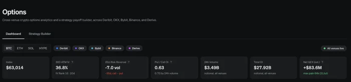
The top row is the market’s quick KPIs. Spot price, 30d ATM implied vol blended across venues, the 25-delta risk reversal (which way skew is leaning and by how much), put/call ratios, total OI, 24h volume, and our estimate of net dealer gamma. As of writing, BTC 30d vol sits at 36.5% with the risk reversal at -7 vol points, showing downside protection is more bid, which is very normal. The IV tile also shows a ranking, so you can tell if vol is rich or cheap against relative to the history we’ve collected so far.
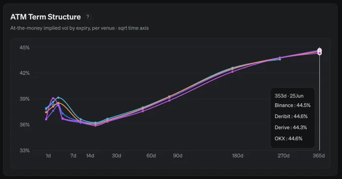
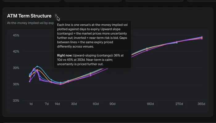
ATM term structure, one line per venue. Most of the time the venues sit within a point of each other, which tells you pricing is efficient. When they separate, that gap could be good info, and it tends to show up in the front end under stress and in less-liquid names. Hover over any point to see each venue’s mark at that expiry, and toggle venues on and off using the names up top. A term structure like the one shown below is pretty common, as the further dated you go the more uncertainty there is, and the higher volatility is priced as a function of that.
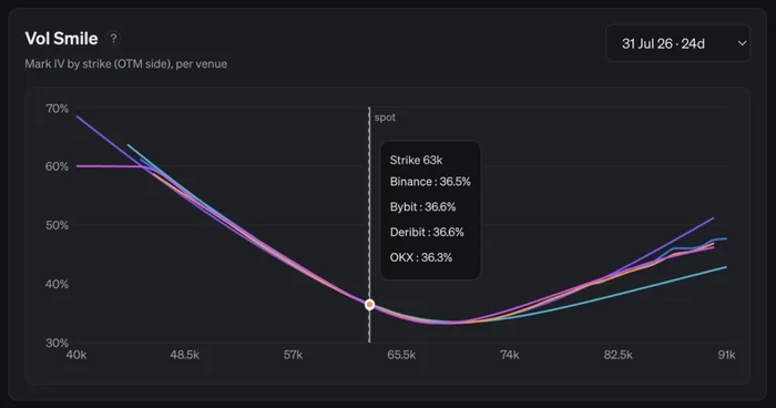
Vol smile and surface. Pick any expiry in the top right and see how each venue prices the put wing versus the call wing, useful for deciding where to actually execute. It’s very common to see the downside bid higher compared to the upside, as people are often hedging their spot holdings. The vol heatmap below this is another way to view the whole smile at once: implied vol by strike moneyness and expiry, so you can read any row as that expiry’s smile and any column as the term structure at that moneyness.
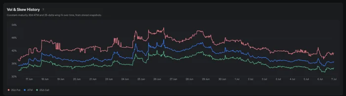
Vol & skew history. Constant-maturity 30d ATM and 25-delta wing vols recorded over time, so you can see whether today’s pricing is elevated or depressed and how the put-call skew has widened or narrowed. This is tracking built from our own snapshots.
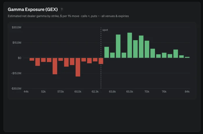
Estimated dealer gamma (GEX). This is our estimate of dealer positioning by strike, built from real open interest with the standard assumptions about which side dealers hold, so view it as a guide rather than certainty. Green zones are strikes where dealer hedging tends to lean against price (selling rallies, buying dips, which can pin price action), red zones are where hedging can accelerate a move. The heatmap below splits the same exposure by expiry so you can see when the big gamma rolls off.
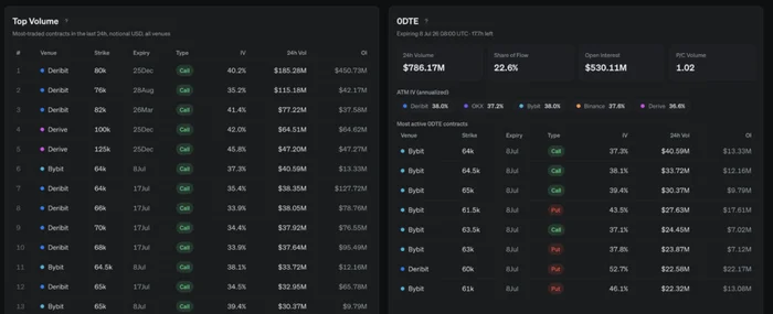
Top volume and 0DTE. The most traded contracts across all venues in the last 24h, and a dedicated panel for same-day expiries, which are currently running about 21% of total BTC options flow. Volume concentration is one of the cleanest reads on what the market is actually positioning for.
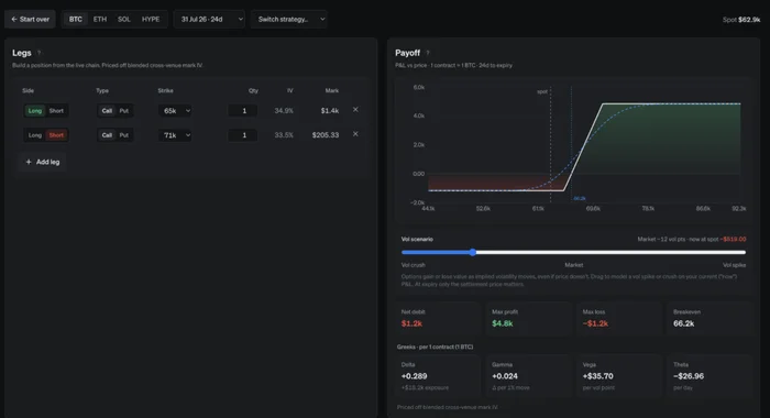
The Strategy Builder is in the second tab up top. You can pick your view (bullish, bearish, sell vol, big move, or hedging), pick how strongly you hold it, and it suggests structures priced off the live chain, with little payoff previews that reshape as your conviction changes. Choosing one gives you the full payoff diagram, breakevens, max PnL, and per-contract greeks, with every leg editable. The vol scenario slider is the piece I’d point at as most helpful, it can show what a vol spike or crush does to your position.
Most panels also include a little “?” that explains how to read it, plus a custom live readout of what the data is saying right now.
Like the funding dashboard, there’s a public API if you want this in your own system or notification bot:
https://delphi-options.vercel.app/api/options?currency=BTC
It returns the full per-venue term structure, smiles, the surface, estimated GEX by strike, top volume, and 0DTE stats, for any of the four assets.